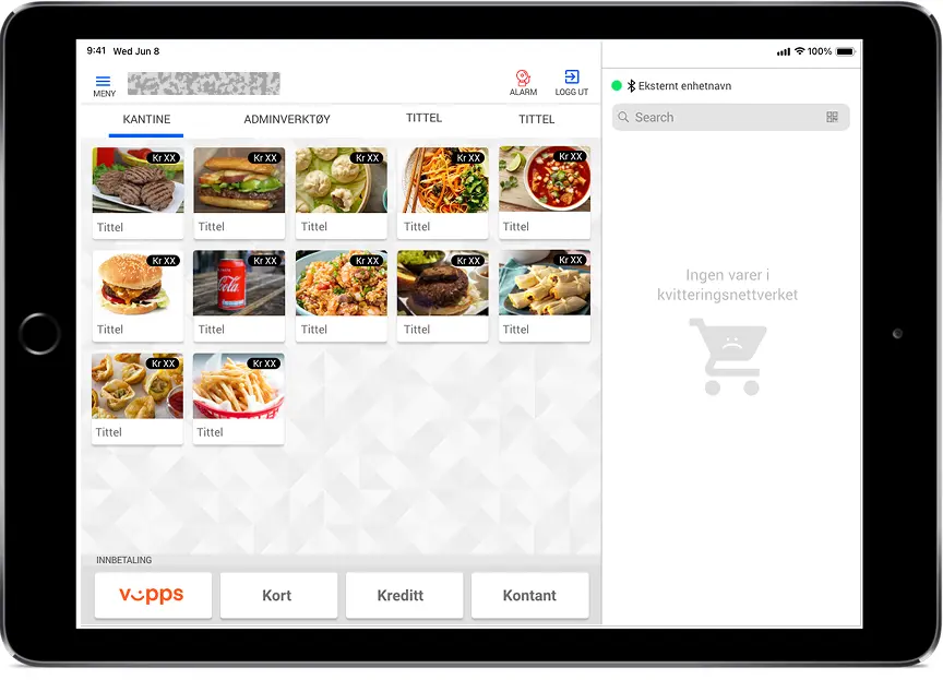
Scalable Mobile POS - Modernizing a Legacy Retail System
Sleeker leaner and flexible POS system for cross verticals
Note: Organization name and references anonymized under NDA
🧭 Overview
This case study outlines the end-to-end UX design process for transforming a legacy Windows-based Point of Sale (POS) system into a scalable, cross-platform POS platform for a Scandinavian retail service provider.
The redesign focused on improving speed, usability, and scalability while ensuring minimal disruption to ongoing store operations.
📌 Project Context
The organization operated across multiple regions using a desktop-only POS. As the business expanded, the legacy system increasingly limited flexibility, performance, and multi-device adoption.
Leadership sought a modern, cloud-ready POS capable of unifying operations, reducing errors, and supporting desktop, tablet, and mobile terminals to support mobility.
🎯 Objective
Design a platform-agnostic POS application running on Android and iOS, intended to complement—rather than replace—the primary desktop POS.
The mobile POS would act as a lightweight companion tool used for queue-busting, quick transactions, and flexible customer processing.
Key Objectives
- Reduce transaction time and training effort
- Support scalability across devices and global markets
- Enable modular integrations with third-party APIs
- Improve user satisfaction and operational efficiency
- Allow cross-vertical expansion with minimal engineering changes
👤 My Role
Role: UX Designer
Responsibilities:
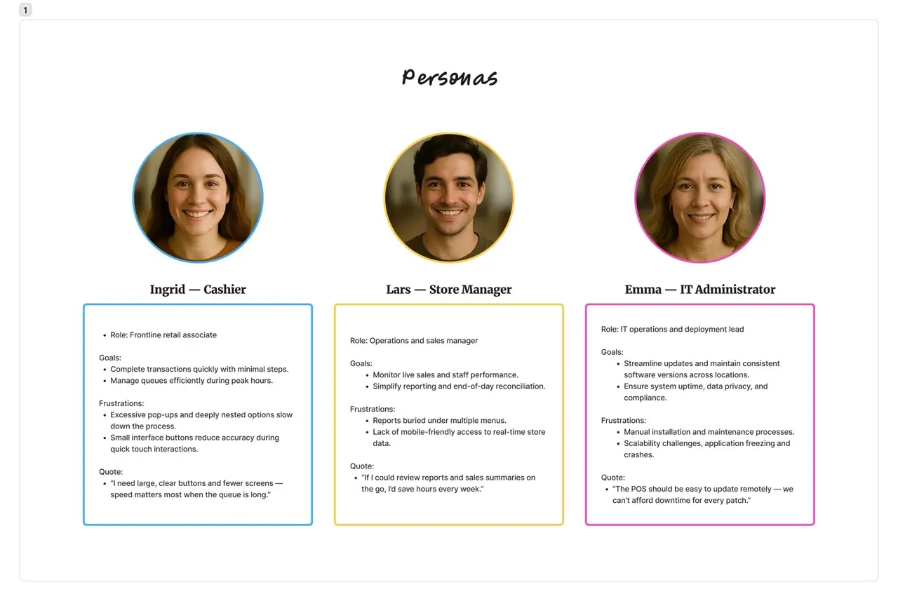
- Partnered with Nordic teams for user research and persona development
- Led journey mapping & information architecture
- Designed wireframes, prototypes, and a modular design system
- Conducted usability testing and iterative refinement
- Collaborated with product and engineering teams for rollout and public launch
🧩 The Challenge
The Windows-based POS was functional but outdated, unable to scale across multiple devices or meet new regulatory requirements.
Core Challenges
- Legacy UI restricted scalability
- Steep learning curve for new employees
- Inconsistent workflows across regions
- No native support for mobile or tablet
- Lack of cloud compatibility
- Required upgrades for Cash Register Systems Act compliance
Key Question:
How might we modernize the POS experience and architecture while maintaining reliability and minimizing staff retraining?
🎯 UX Goals
- Unify UI across tablet, and mobile
- Simplify workflows for faster transactions
- Establish a scalable, component-driven design system
- Improve accessibility for multilingual regions
- Enhance usability for both cashiers and managers
🔍 Research & Insights
Methods
- Contextual inquiries in live retail environments
- Analysis of customer tickets to identify recurring issues
- Benchmarking leading regional POS competitors
👥 Understanding Users
The redesigned POS served various retail roles across the Scandinavian region, where efficiency, clarity, and reliability are crucial.
Key Insights from Personas
- Users value clarity, speed, and predictable interface behavior
- Harsh environments require large touch targets & high contrast UI
- Managers need mobile dashboards for real-time store visibility
- IT teams prioritize remote maintenance and enhanced security
Strategy
The UX strategy focused on a fast, scalable MVP aligned with modern retail operations.
Guiding Principles
- Efficiency: Optimize high-frequency tasks
- Scalability: Modular components across devices
- Clarity: Clean, intuitive visual hierarchy
- Accessibility: Touch-friendly UI, WCAG colors, multilingual support
- Architecture-first alignment: API-first backend compatibility
- Modularity: Feature toggles based on business needs
🏗️ Information Architecture
POS was reorganized into three functional layers:
- Transaction Layer – Scan, add, payment, receipt
- Operations Layer – Shifts, refunds, staff tasks
- Analytics Layer – KPIs, reports, insights integration with reporting system
This structure supports future feature expansion without major UI redesign.
🎨 Design Evolution
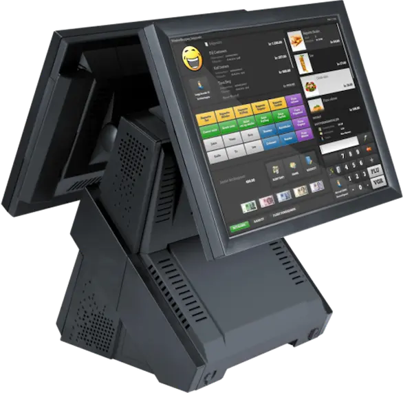
🕰️ Before State (Legacy Desktop POS)
- Desktop-only interface
- Dense product tables and slow load times
- Multi-step transaction workflow
- Poor adaptability and long maintenance cycles
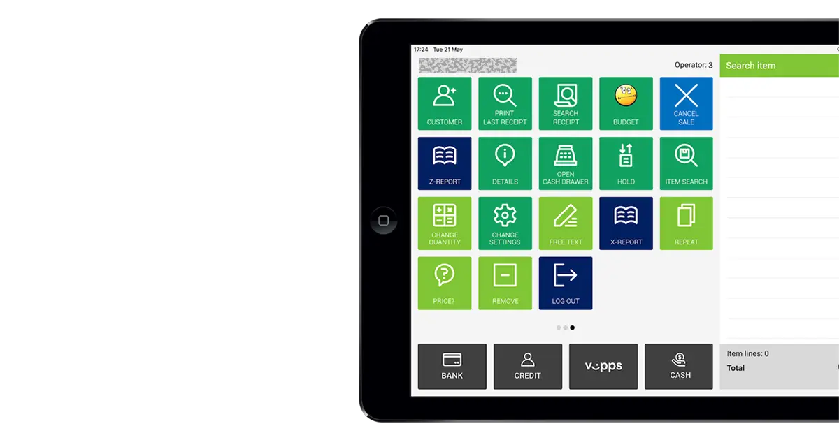
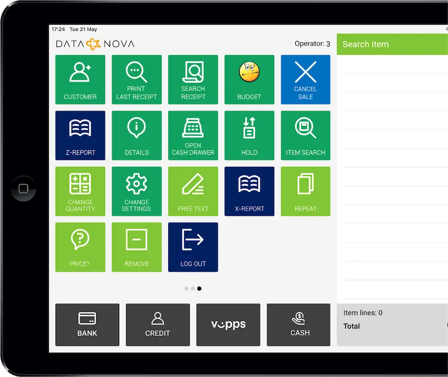
🚀 After State (Mobile/Tablet POS)
- Adaptive design for tablet and smartphones
- Modular, card-based interface and minimal design
- Streamlined workflow: scan → pay → receipt
- Real-time dashboard and customizable views
- 44px touch targets + high-contrast color palette
🖌️ Design Process
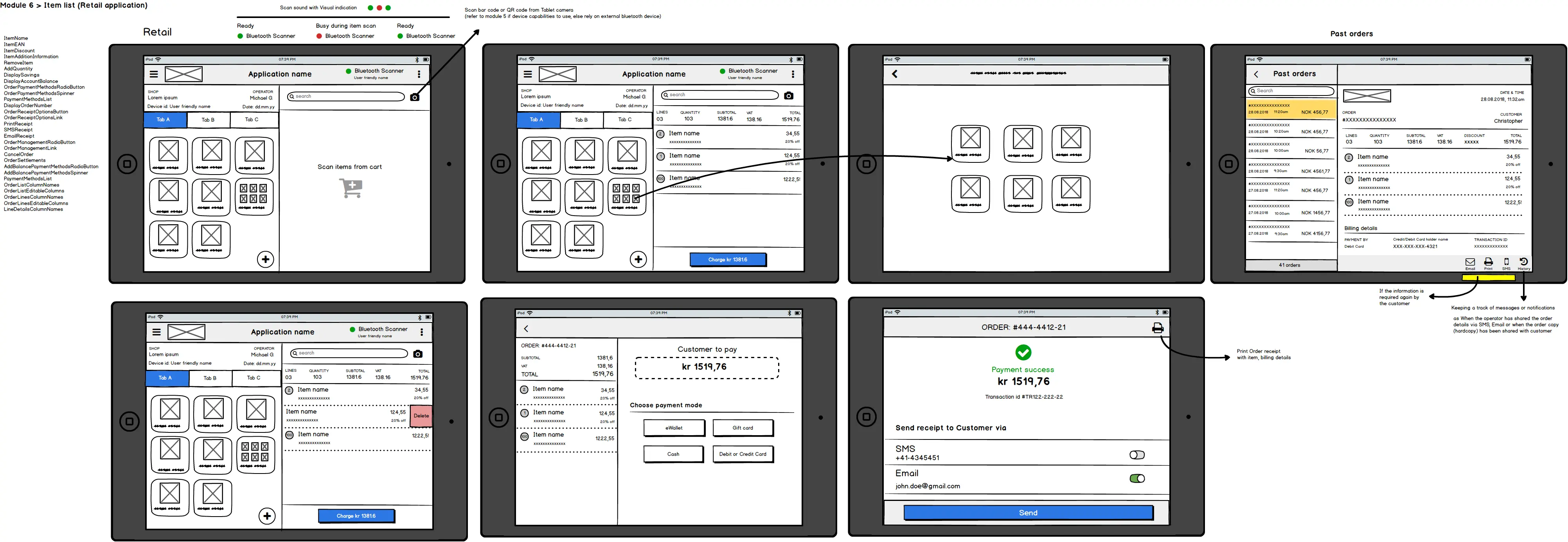
1️⃣ Wireframes
Low-fidelity wireframes (Balsamiq) for mobile and tablet.
Key Focus Areas
- Reduced cognitive load
- Large tapable icons
- Gesture shortcuts for faster actions
- Swipe interactions to add/remove items
- <3 taps for essential flows
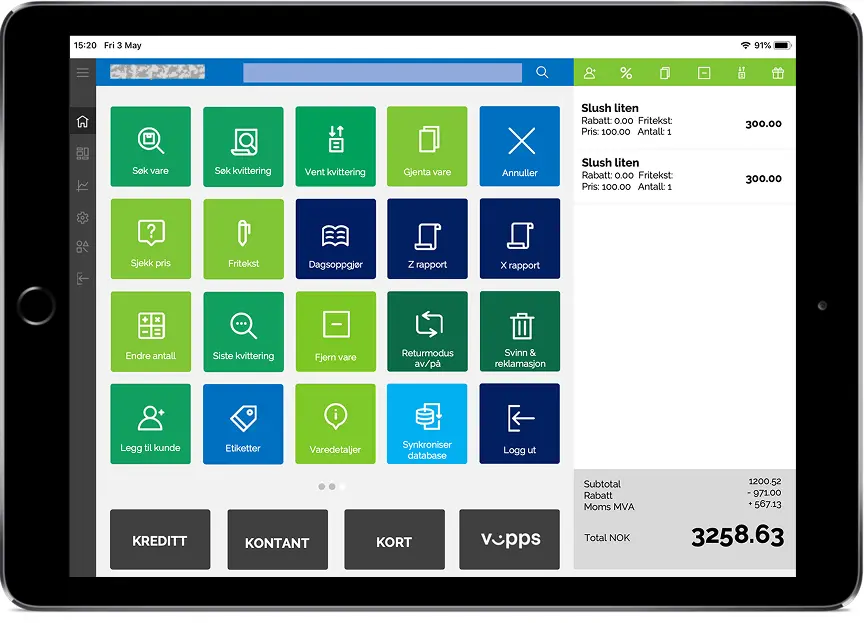
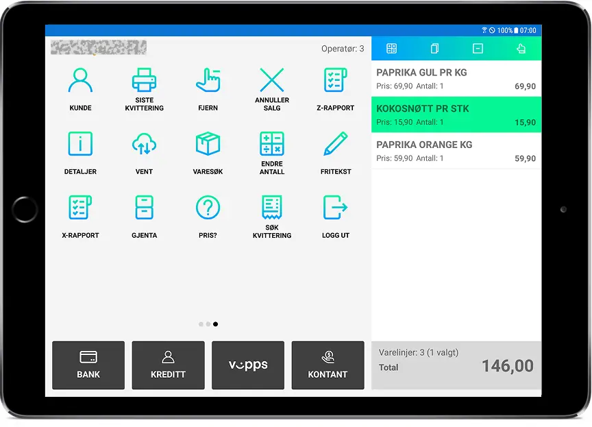
2️⃣ Visual Explorations
Explored three design directions:
| Variation | Description |
|---|---|
| A. Light Minimalist Theme | Clean, neutral layout optimized for clarity and speed. |
| B. Vibrant theme | Retail-focused, high-visibility palette |
| C. Simplified Neutral UI | Enterprise-ready design aligned with rebranding efforts. |
Also tested a Dark Theme for low-light environments.
User tests favored Light Minimalist for clarity and reduced fatigue.
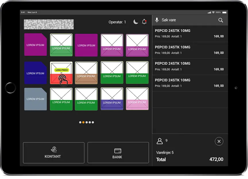 Visual Exploration D: Dark theme
3️⃣ Voice Interaction Prototype (VUI)
Explored voice commands to reduce manual navigation and improve accessibility.
Concept:
“What if operators could speak commands instead of navigating menus?”
Examples:
- “Add item 2456”
- “Apply 10% discount”
- “Print receipt and close order”
VUI showed strong potential for hands-free workflows and inclusive design.
🧪 Prototyping & Testing
Process
- Built interactive prototypes covering cashier & manager journeys
- Conducted usability sessions across user segments
- Measured task completion, errors, satisfaction
Key Findings
| Issue | Observation | Solution |
|---|---|---|
| Small buttons | Frequent mis-taps | Increased touch target size |
| Payment overload | Too many actions | Step-by-step payment modal |
| Report discovery | Hard to locate | Added dashboard shortcut |
🚀 Launch & Impact
The redesigned POS was deployed across 12 pilot stores in Europe.
Performance Metrics
| Metric | Before | After | Improvement |
|---|---|---|---|
| Checkout time | 2.8 min | 1.9 min | ⏱️ 32% faster |
| Training duration | 7 days | 3 days | ⏱️ 57% shorter |
| Deployment | Manual | Cloud-based | ☁️ Streamlined |
Business Outcomes
- Faster onboarding across 100+ outlets
- Reduced maintenance via unified architecture
- Improved customer service through faster checkout
- Foundation for expansion into new verticals
- Voice UX recognized as an innovation pathway
📈 Key Achievements
- Unified POS for Android & iOS
- 85% faster onboarding
- 66% reduction in transaction errors
- Accessibility-first design adoption
- 70% faster release cycles via cloud deployment
💬 Reflections & Learnings
- Real-world observation is essential in enterprise redesigns
- Field testing validated efficiency gains
- Early dev alignment ensured scalable architecture
- Voice-first design required new IA patterns
- Collaboration with local teams ensured compliance and cultural relevance
✨ Conclusion
The POS redesign evolved a legacy desktop system into a modern, scalable, multi-device retail ecosystem.
As the UX designer leading the full process, I ensured every design decision aligned with usability, scalability, and operational efficiency—resulting in a faster, more intuitive, and future-ready POS platform.
“Scalability isn’t just a backend challenge — it’s a UX commitment to clarity, flexibility, and focus.”
