Data Analytics Dashboard for Team Performance
Visualizing Support Operations, Identifying Bottlenecks, and Improving Real-Time Decision-Making
Note: Organization name and references anonymized under NDA
🏢 Organization Brief
The project was executed for a mid-sized European technology company specializing in enterprise software for retail, operations, and workflow management. Their distributed support organization serves multiple global clients across several time zones, handling a high volume of customer requests through email, live chat, phone, and technical support tickets.
As operations scaled, support teams struggled with fragmented reporting, outdated dashboards, and multiple disjointed tools. Managers lacked a consolidated view of team health, SLA risks, and workload distribution—forcing them to rely heavily on manual reporting processes.
This gap created a strong need for a real-time, unified performance dashboard to improve visibility, reduce operational friction, and enable data-driven decisions.
🧭 Overview
The Team Performance Dashboard was built to provide instant visibility into:
- Staff availability and workload
- Ticket inflow and case aging
- SLA performance and risk
- Channel distribution (email, phone, diagnostics)
- Customer satisfaction patterns
The dashboard replaced scattered spreadsheets and outdated UI components with a centralized, real-time analytics platform—helping support leaders shift from reactive firefighting to proactive operations management.
📘 Project Context
Customer and technical support teams are the backbone of service organizations. However, their performance reporting was manual, fragmented, and non-visual.
Leaders and team managers lacked a real-time understanding of:
- Staff workload
- Case resolution trends
- SLA compliance
- Customer satisfaction
The Team Performance Analytics Dashboard addressed these gaps by presenting actionable insights at a glance.
🎯 Objective
Design a real-time, interactive performance dashboard that:
- Unifies all critical support KPIs
- Shows staff availability and workload at a glance
- Highlights SLA risks using clear color-coded signals
- Visualizes ticket trends and customer sentiment
- Enables proactive staffing, load balancing, and escalation decisions
- Reduces cognitive load through clean and minimal design
🧩 What we did
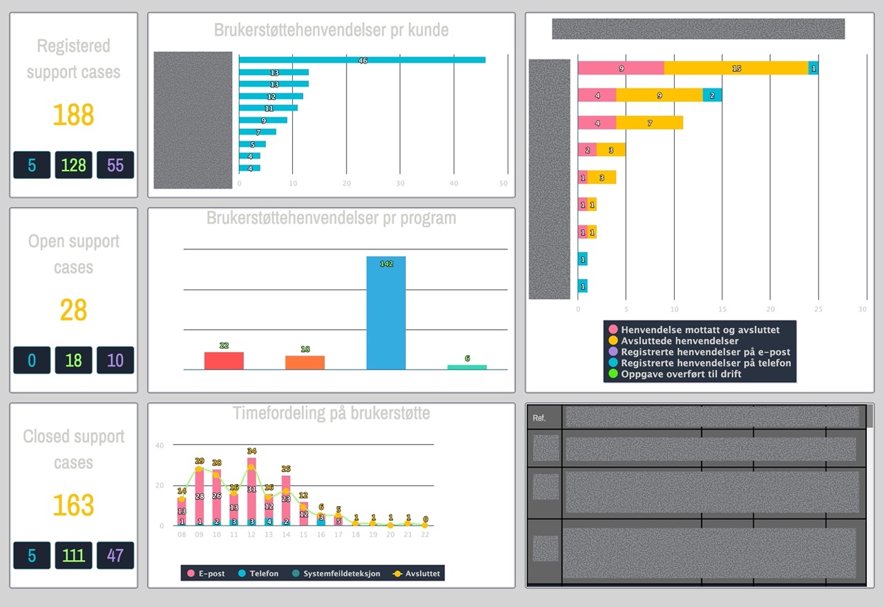
1. Evaluated the Legacy Dashboard
Audited the existing tool to identify missing KPIs, inconsistent visuals, unclear terminology, and gaps in end-to-end visibility.
Findings:
- Missing critical KPIs (SLA risk, agent distribution)
- Readability issue due to poor contrast-ratio
- High cognitive load during peak hours
- Missing distribution of Diagnostic task
2. Conducted Stakeholder & SME Interviews
Spoke with support agents, team leads, and operations heads to uncover pain points, expectations, and workflow realities.
Revealed:
- Heavy reliance on manual reporting
- Difficulty identifying SLA risks in time
- Need for clear performance cues
- Lack of trend visibility
3. Observed Real-Time Support Operations
Shadowed 2–3 hours of live work to understand tool-switching patterns, peak-hour pressure points, and informal workarounds.
 Artistic Impression for contextual inquiry
Captured:
- 5-10 tool switches per hour
- Missed SLA threats
- Stress spikes during peak load
- Use of Excel or notes for tracking
4. Analyzed Historical Ticket Data
Reviewed SLA breaches, hourly volume spikes, category-level inflow, escalation patterns, and agent-level workloads.
Highlighted:
- Breaches mainly due to aging tickets
- High inflow periods around specific hours
- Uneven agent workload distribution
- Diagnostic tasks caused longest resolution delays
5. Defined User Goals & Data Hierarchy
Structured performance information into: Global KPIs → Alerts → Workload → Trends → Drill-downs
Behavioral Clustering Clustered users by:
- Monitoring habits
- Decision-making needs
- KPI dependency
-
Dashboard usage frequency
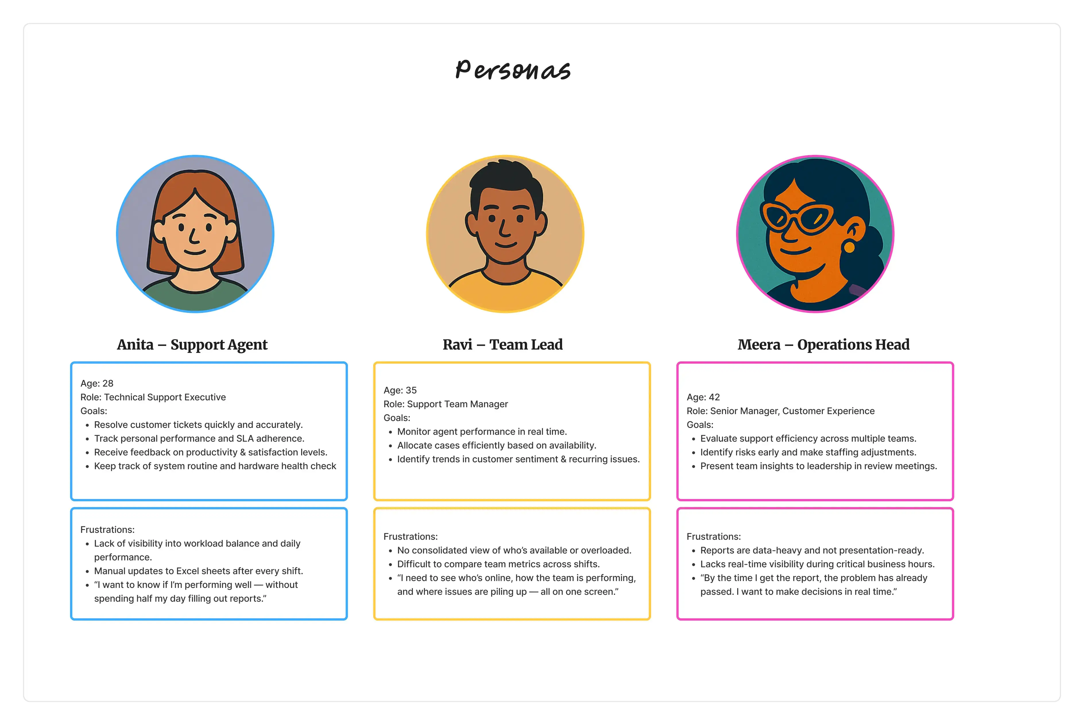
- Anita — Support Agent Needs clarity on tasks & daily KPIs.
- Ravi — Team Lead Needs real-time visibility into risks, load, and agent presence.
- Meera — Operations Head Needs clean (report) exports & long-term trend insights.
Personas were validated with supervisors to ensure accuracy and alignment with real workflows.
6. Designed Wireframes & Interactive Prototypes
Explored multiple layouts emphasizing urgency, scanning behavior, and real-time monitoring.
7. Validated Feasibility With Developers
Aligned data refresh cycles, API limitations, chart libraries, and interaction constraints.
8. Presented Iterative Designs to Leadership
Walked stakeholders through structured iterations with improved KPI definitions and narrative clarity.
9. Usability testing and Validation
Task-based testing with think-aloud protocol.
👥 Personas
🕵️♂️ Problem Framing & Opportunity Areas
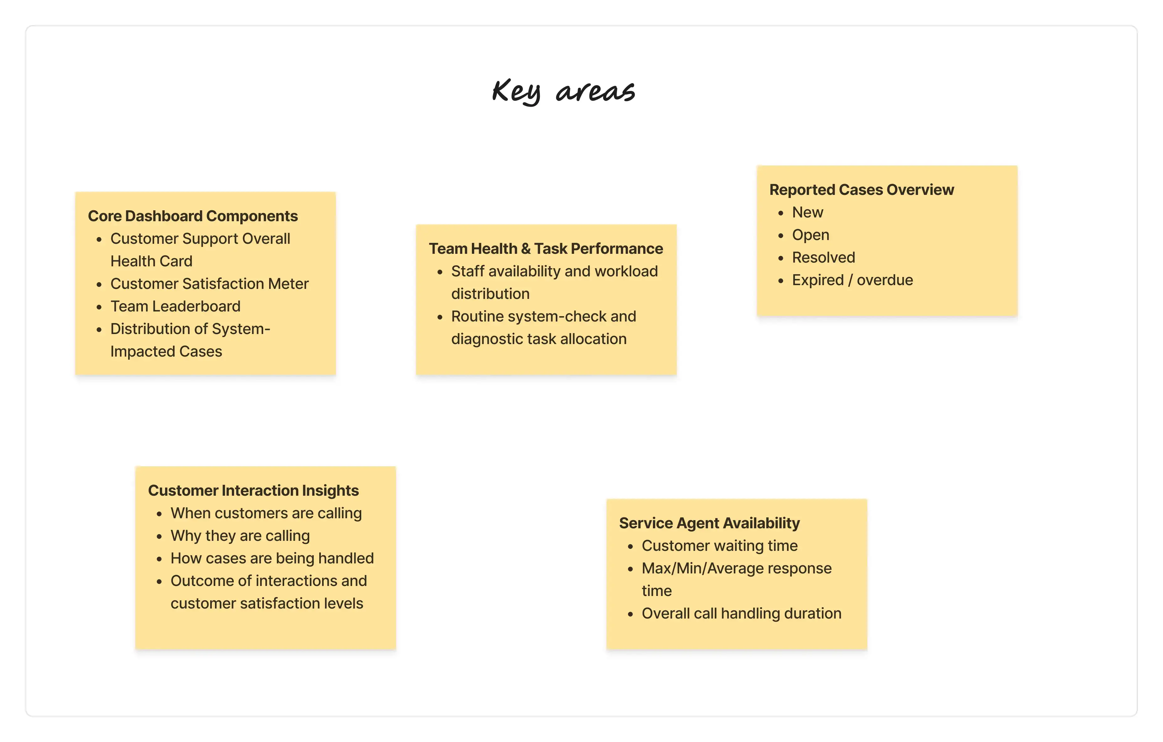
Based on Personas and the “How Might We” exploration, we identified key opportunity areas to guide the design of a unified Customer Support Dashboard for distributed support teams.
How Might We (HMW) Questions
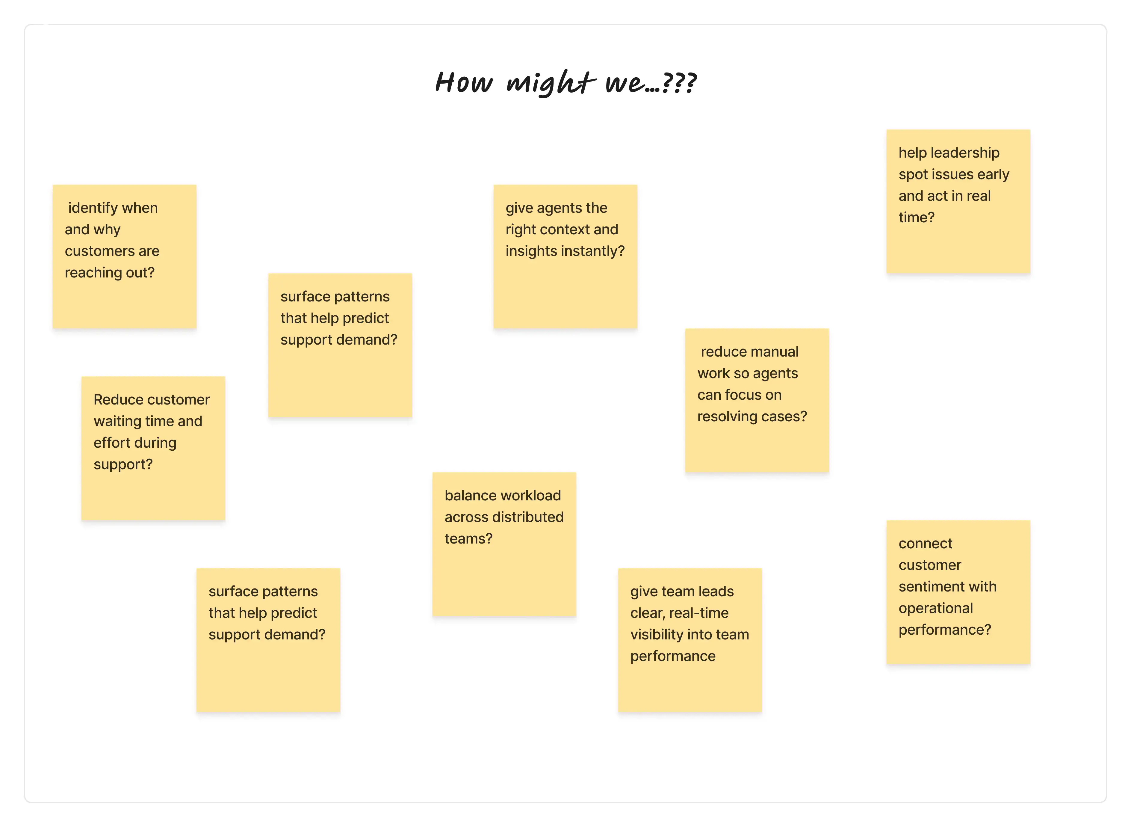
Key Focus Areas for the Dashboard
🎨 Design Evolution
1️⃣ Early Concepts
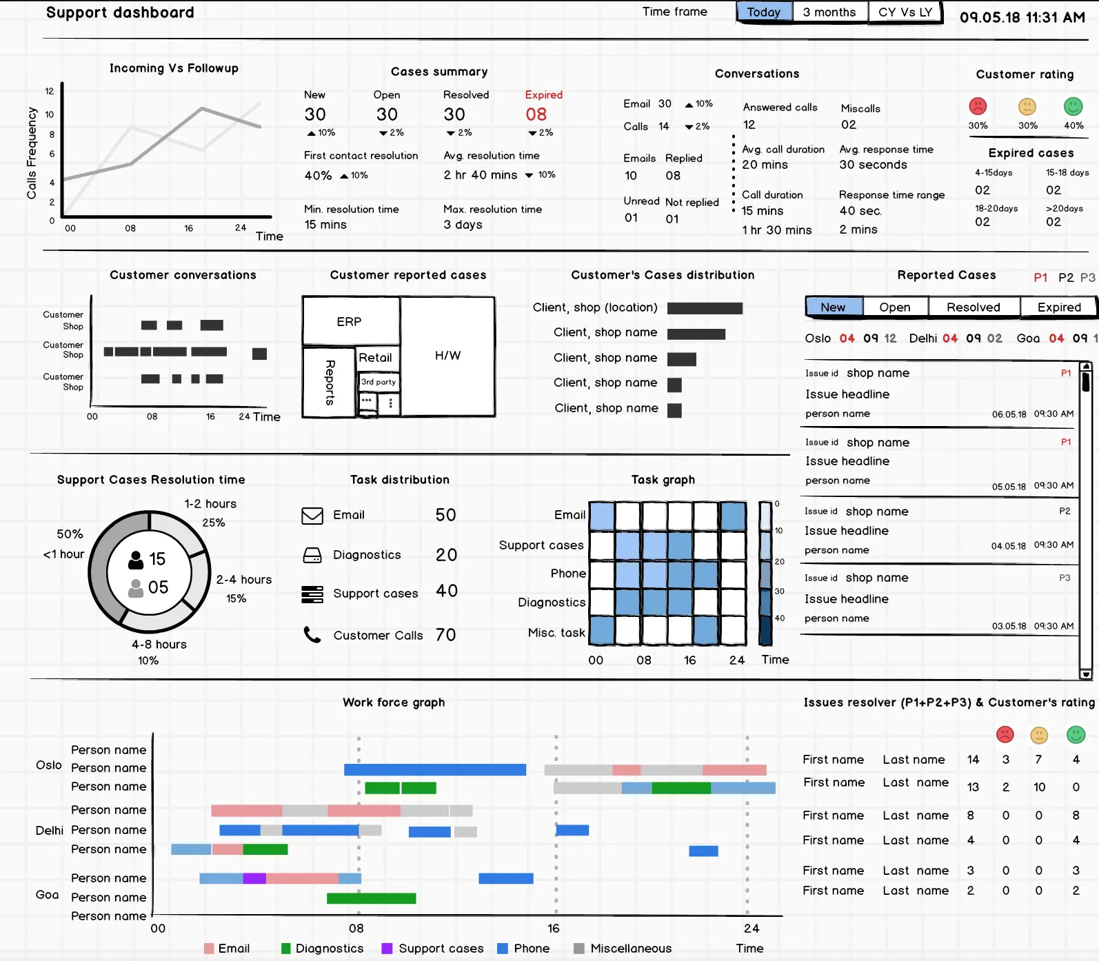
- Dashboard is linked to two more sections
- Customer health and Diagnostic Task/Vigilance Activity.
- Dashboard capture following parameters:
- Cases Summary (New, Open and Closed)
- First time resolution (Cases)
- (Avg.) Customer Waiting time and Resolution time
- Cases regional distribution among teams
- Top performers based on resolved cases and calls attended
- Resolution time Vs Cases distribution
- Resolution timeline (Time Vs Cases)
Wireframe
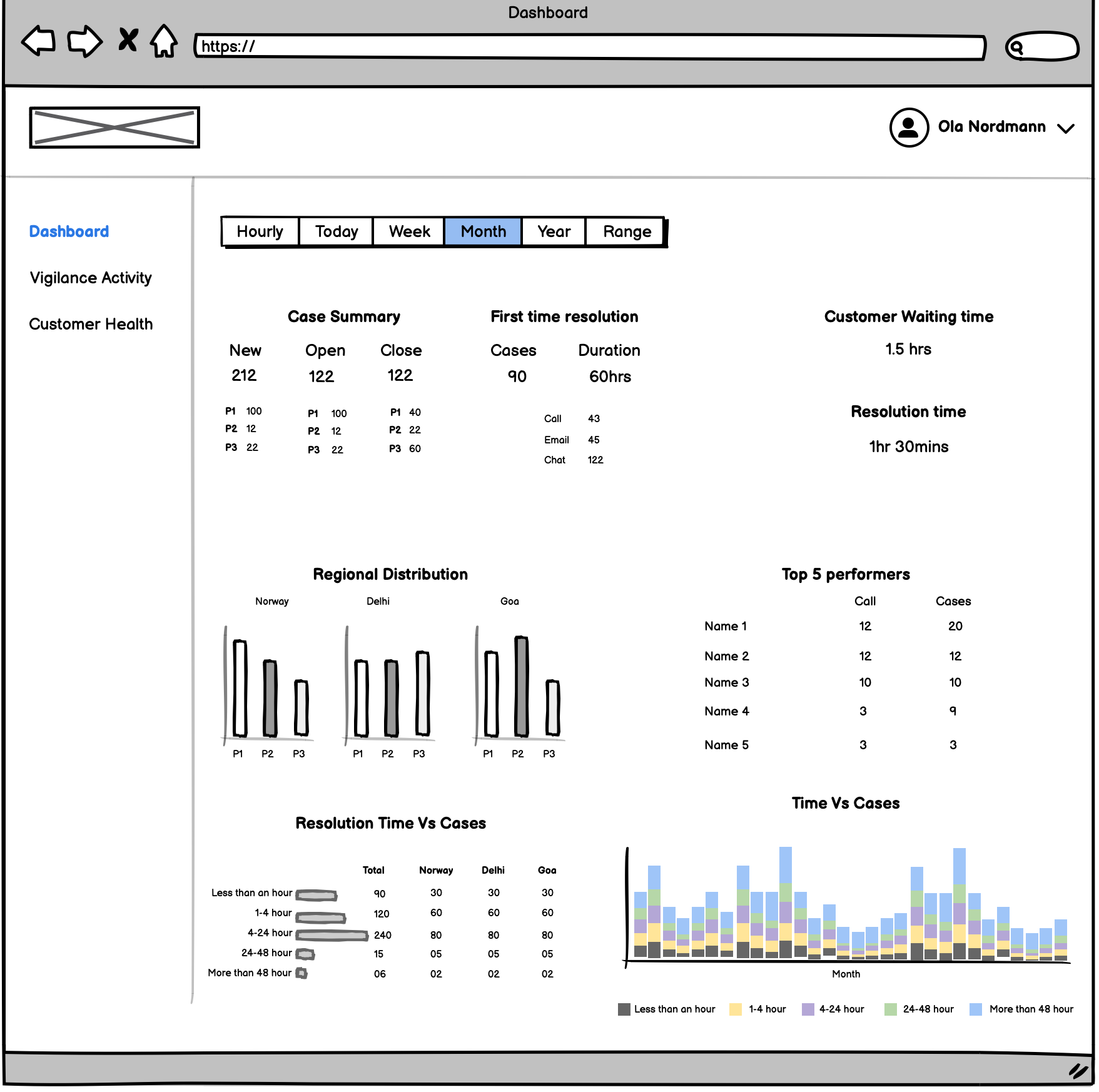 Early Wireframe
 Hi-Fi Design
Based on the initial findings we have noticed that:
- We are missing trends
- How support team is occupied with other task is not available in same view
- The dashboard needs a comprehensive view based on the diagnostic and vigilance activities to be performed by support team
- It was not clear how often customer calling & sending emails
- Little more experimentation required around color palette as it require constant gazing and attention
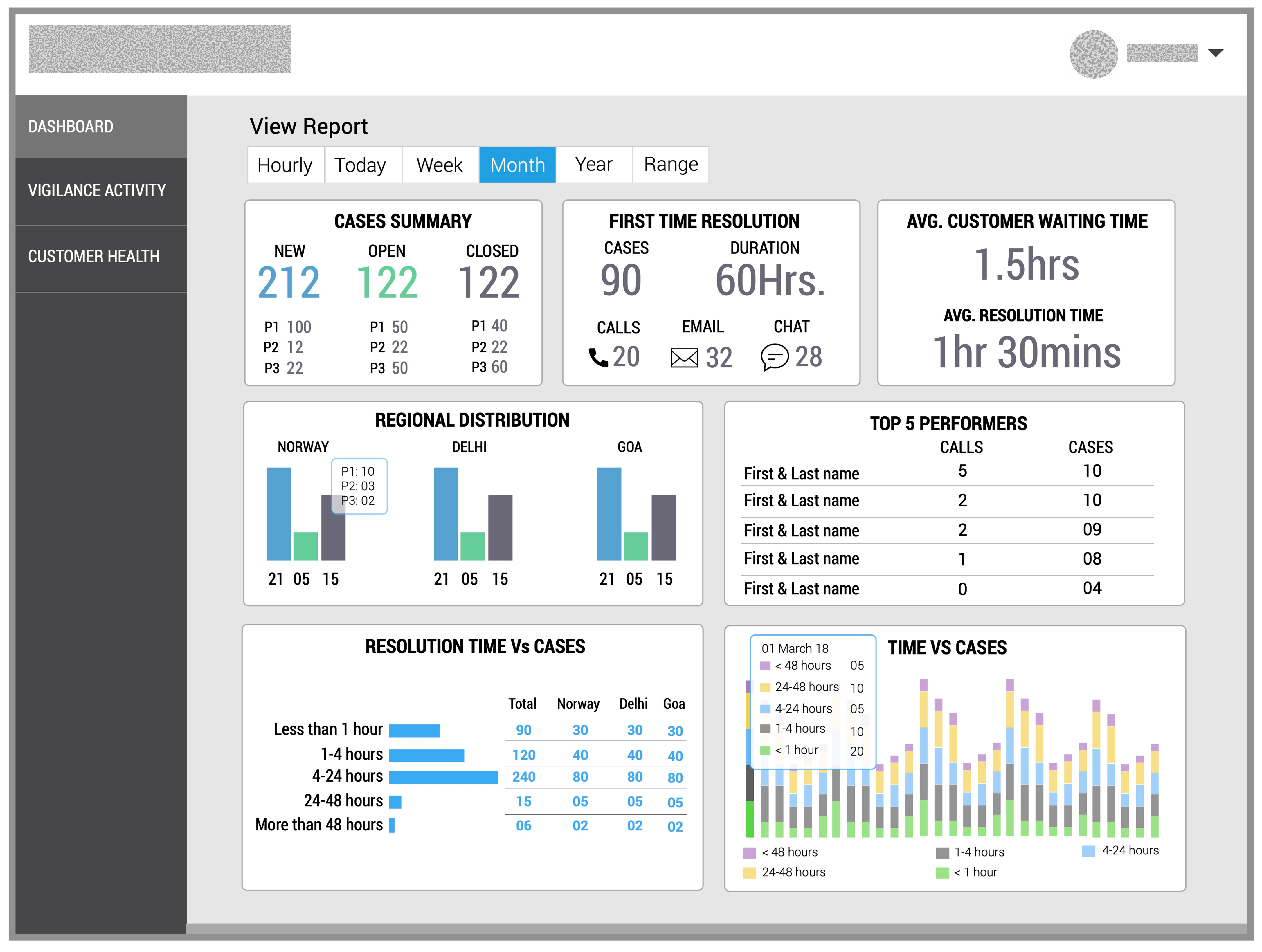
Alternative Approach
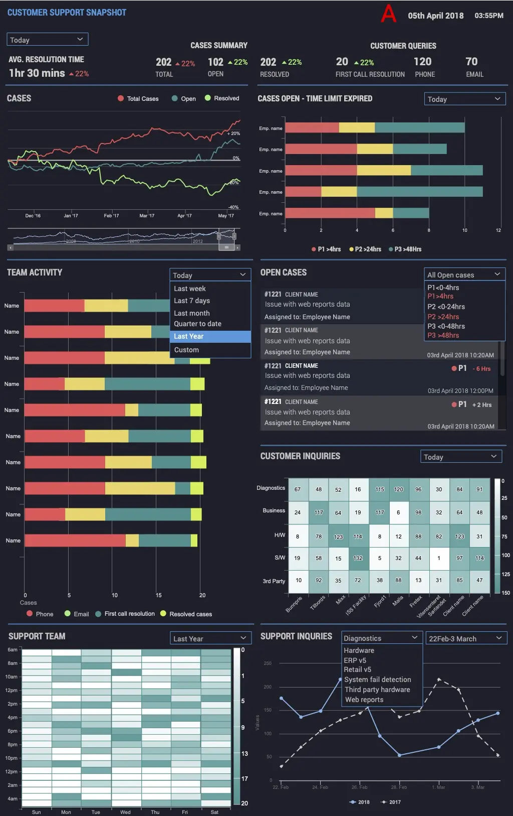
As an alternative version, we came up with the following visualization:
- Widgets info
- Avg. resolution time & Case summary With trends based values
- Customer queries via Phone and Email
- First call resolution
- Cases distribution (Total, Open and resolved)
- Cases distribution based on severity P1, P2 and P3
- Team activity over Phone, Email, First call resolution & overall resolved cases
- Open cases
- Information hierarchy: Separate global KPIs (team level) from individual agent data.
- Color logic:
- 🟢 Green = Performing Well
- 🟠 Amber = Needs Attention
- 🔴 Red = Critical Performance
- Data storytelling: Trends, heatmaps, satisfaction meters
- Scalability: Modular components, future-ready layout
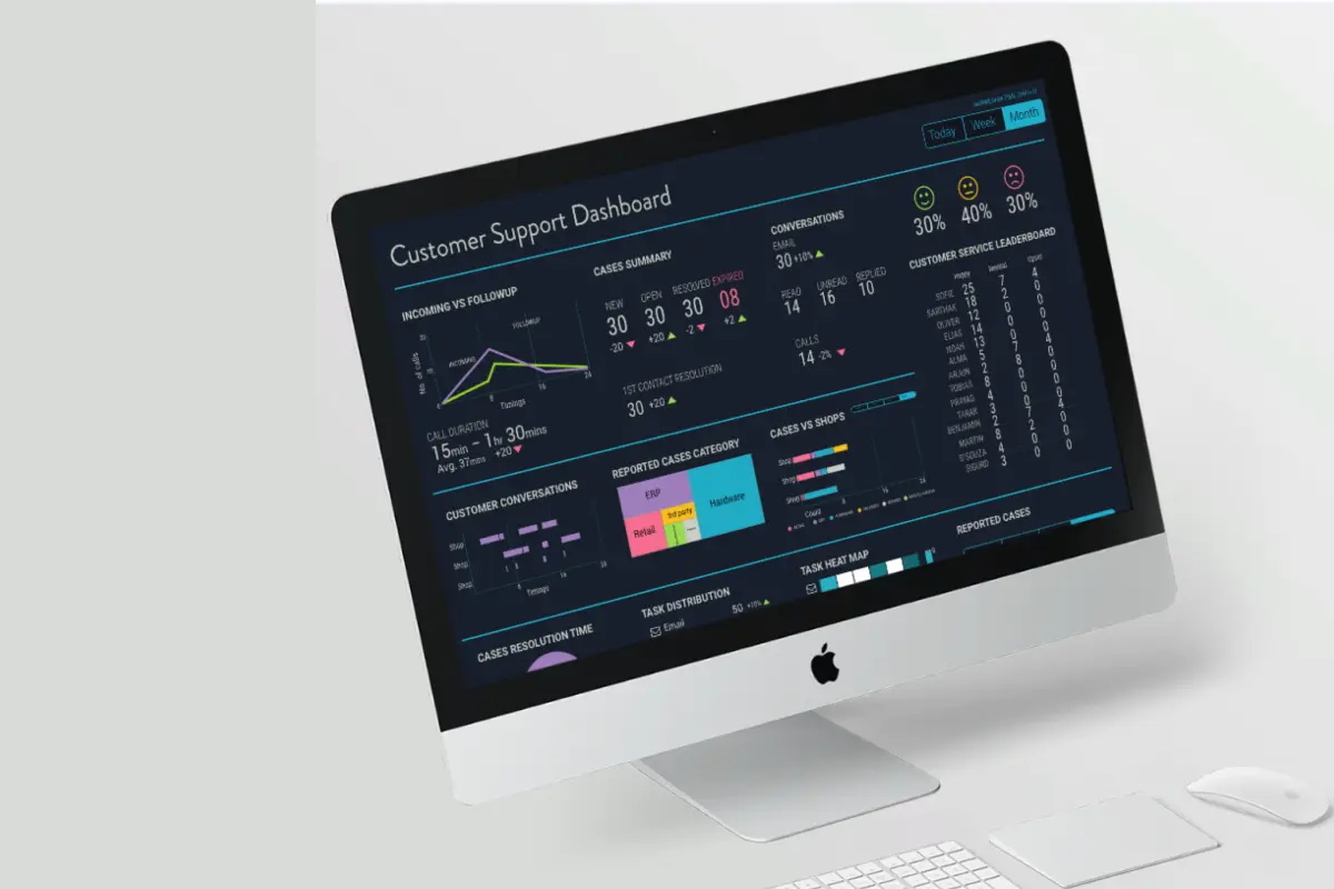
Transition to Dark Theme for Support Dashboard
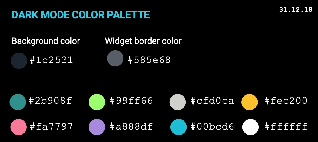
The legacy support dashboard was designed with a light theme, which has proven to be visually stressful during prolonged usage. Based on user feedback, operational requirements, and research, we propose transitioning to a dark theme for the following reasons:
Key Drivers for Change
- Operational Context
- The support team operates in multi-shift environments, including night shifts, where a light theme increases glare and discomfort.
- Continuous monitoring of dense data and alerts requires a design that minimizes visual fatigue.
- User Well-being
- Dark themes reduce overall luminance, minimizing glare and eye strain during extended usage.
- Supports long monitoring hours and improves comfort in low-light conditions.
- Cultural & Aesthetic Considerations
- Initial design iterations incorporated muted, pastel tones to align with cultural preferences.
- Experimentation ensured adequate contrast and readability without sacrificing visual appeal.
Guiding Principles
- Reduce overall luminance to minimize glare.
- Enhance readability of dense data visualizations (heatmaps, trends, real-time graphs).
- Highlight critical information while reducing visual noise.
- Maintain contrast ratios for accessibility compliance (WCAG standards).
 Early Design - Customer Support Dashboard
2️⃣ Final Dashboard
To further refine the narrative and ensure data clarity we came up with following wireframe through multiple iterations, the final layout included:
- Unified KPI bar (SLA, volume, customer happiness)
- Staff availability & presence indicators
- Customer service leaderboard
- Ticket aging visualization
- Heatmaps for workload distribution
- SLA-tier-based case highlighting
- Performance movement indicators (↑ / ↓)
- Modular, scalable layout
- Dark theme color palette
Wireframe
 Final Wireframe - Customer Support Dashboard
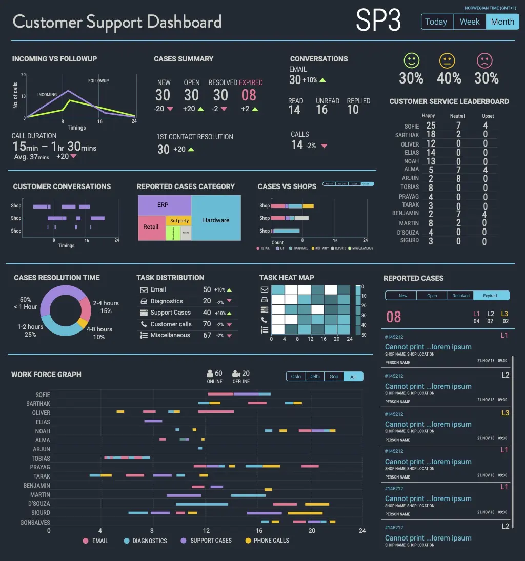 Hi-Fi Design - Customer Support Dashboard
🧪 Usability Test Findings
Participants: 6 support leads, 2 operations managers
Method: Moderated remote sessions, think-aloud protocol
Tasks: 8 key scenarios (identify SLA risk, check agent capacity, etc.)
Key Results
- Task Success Rate: 92%
- Average Task Time: 12 sec (vs 45 sec previously)
- Risk Detection: Users immediately identified SLA breaches
Improvements Made
- Increased SLA font size (18px → 24px)
- Added tooltips for all acronyms
- Moved critical alerts to top-left for high visibility
⚙️ Technical Constraints & Limitations
Data Sources
- Ticketing API
- Internal reporting engine
- Workforce management system
Constraints
- 10-minute data refresh
- API rate limits
- 6-month data retention
- Standardized chart components (library restrictions)
Impact on Design
- Added “Last updated” timestamp
- SLA timers adjusted for ±1–2 min delay
- Trend charts restricted to 90-day window
🚀 Outcome & Impact
| Metric | Before (Manual Reports) | After (Analytics Dashboard) | Improvement |
|---|---|---|---|
| Data visibility | End-of-day Excel files | Real-time dashboard | ⚡ Instant updates |
| SLA monitoring | Manual tracking | Automated live metrics | ⏱️ 75% faster insights |
| Report preparation | 2 hrs/day | Automated visualization | 💡 Saved 8 hrs/week |
| Decision-making | Reactive | Predictive | 🔄 Shift to proactive management |
✨ Conclusion
The Team Performance Dashboard evolved from fragmented reporting into a dynamic, real-time intelligence system. It enables the organization to:
- Detect operational risks early
- Improve staff productivity
- See performance trends clearly
- Make fast, data-backed decisions
“When teams can see their data clearly, performance improves naturally.”